Category Archives: journal

My Not-So-Easy-to-Fill Journal and it’s Reclaiming

For the last six months a journal has sat on my studio table.  From time to time I have paged through this journal and added a thing here or there, completing some pages along the way.  On those page throughs however this journal has often stopped me, stumped me, and other wise frustrated me like no other journal has.  This journal has a looming deadline and must be conquered before time is up and my frustrations were quickly turning to a panicky feeling every time I was near this nearly empty, needed to be filled, monster on my studio table.
What journal is this you ask?  How is it possible that someone who writes grocery lists on fine art paper and will splash watercolor with near abandon on a thirty dollar sheet of Arches can be stopped by a collection of color copied sheets bound into a book?  Those are the exact questions I asked myself this week.  Why?  Why is this a stopping place instead of a jumping in place?
This week I finally had an answer to that question – I have been trying too hard.  Trying for perfect.  Waiting for the right idea for every page.  Desiring that each and every background would shine and be the star it was meant to be.  As an artist I recognized that desire, the elusive quest for perfect and as an artist, I also was seeing the same results, nothing; a not-so-blank-sheet as it turns out.  When perfect is the goal, nothing is the result, because nothing is perfect, particularly when making art.  We all see the flaws we create so clearly that the resulting work will never be perfect.  It will be so completely un-perfect that we will be stopped in our tracks.
Thankfully, I also remembered our goal and original starting place for this idea.  The Smash Journal and the desire to make our own custom version to use as a collaborative project because it was fun.
Let’s get reacquainted with the original idea:
Watch the Smash Journal video.
If you type Smash Journal into Google images.
If you have followed my links you should see a common thread of delicious non-perfection.  A mash-up of lives, ideas, images, drawings, and day to day stuff that is glued down and penned in with abandon. Books bursting with extra papers and lovely unique liveliness.  No thought was given to the background other than that it was a vehicle for the stuff contained on the page.  Not perfect and in its non-perfect state we reach wonderful, fabulous page turning journal goodness.
In my focus on the not-so-blank part of the project I was forgetting the most important part of the project title – journal.  A journal is a personal record of experiences, thoughts, events, and observations.  A record of a daily life on paper.  This week my focus came off the project as a vehicle for perfect pages and went to a focus on the project for MY pages, it is a journal after all.
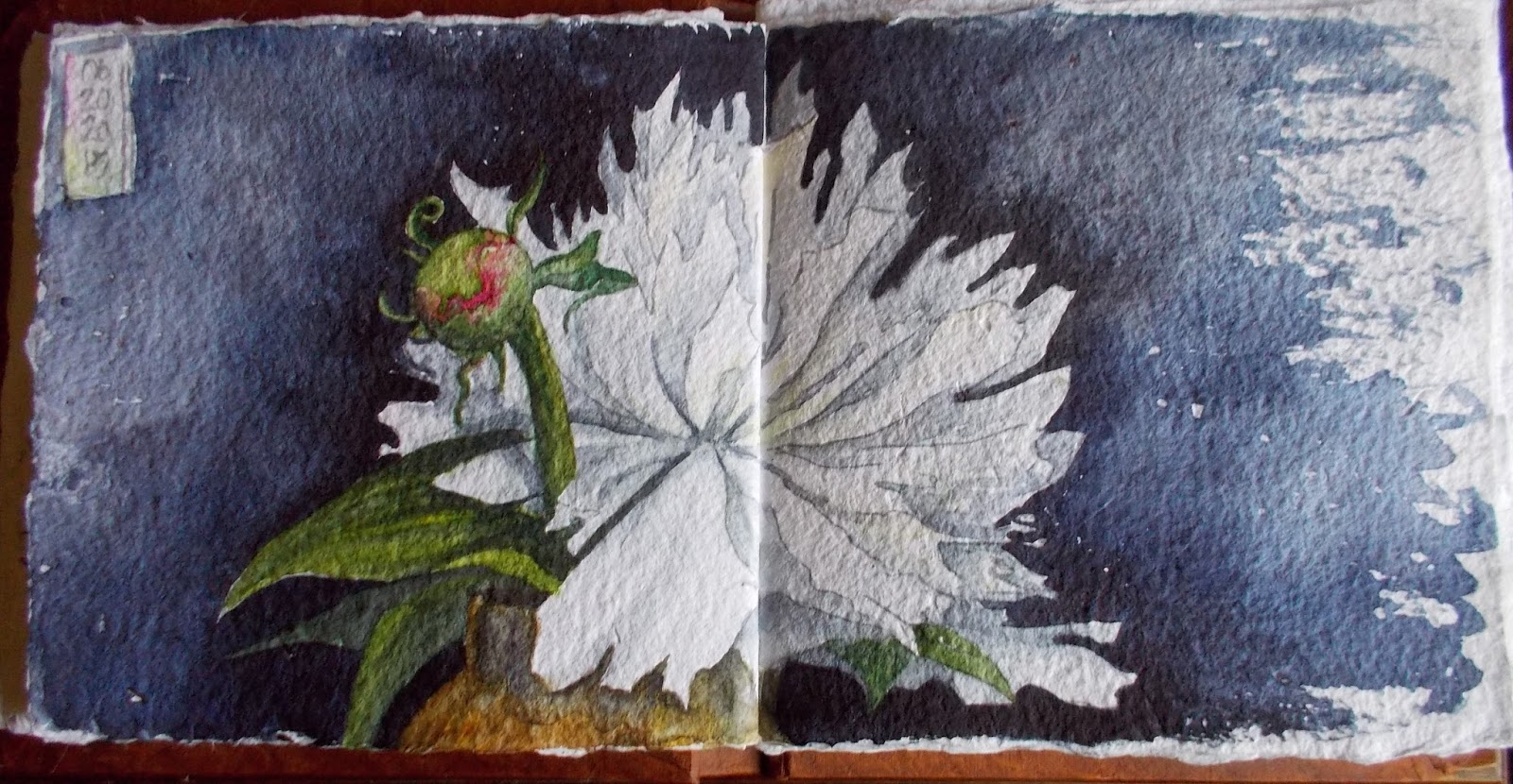
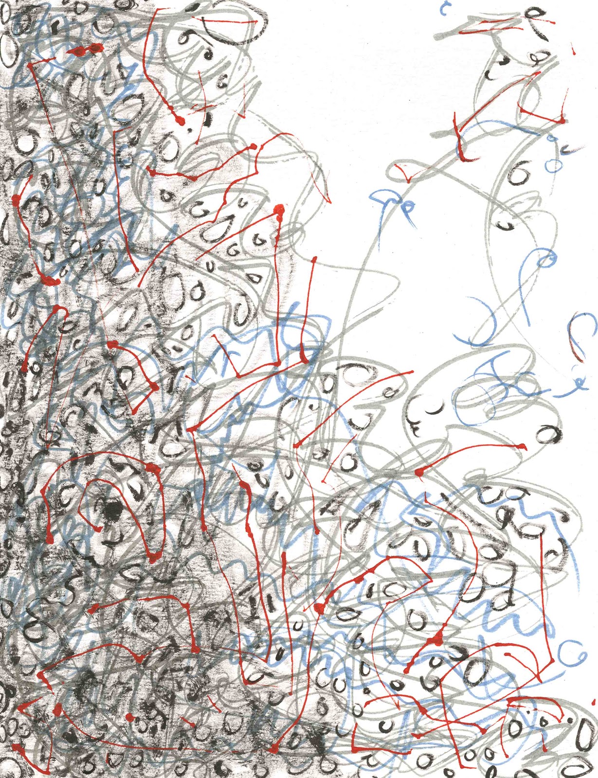
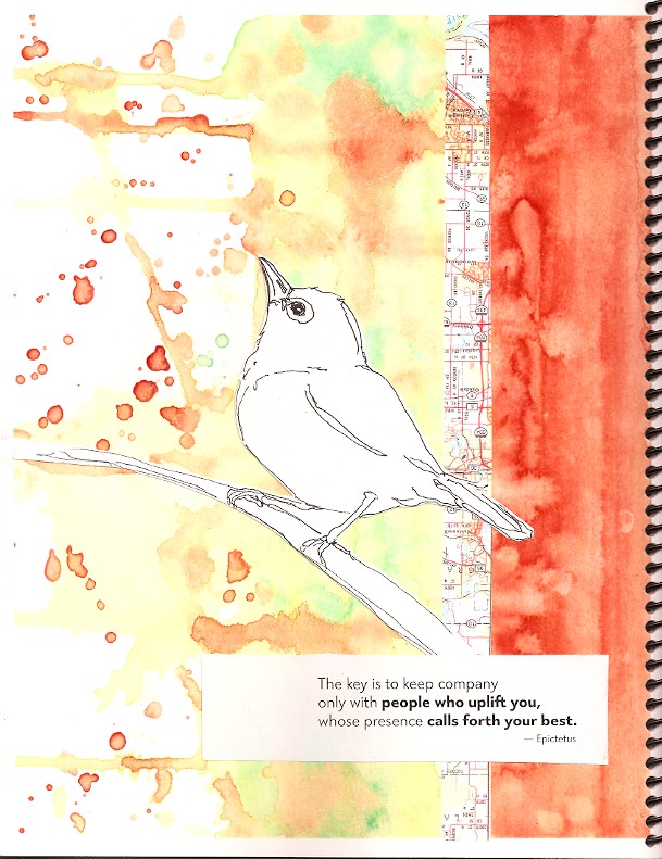
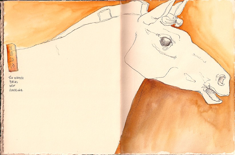
With the pressure to create perfect pages off my back I have been creating my pages all week with complete and utter abandon.  Oh, I am still going out of order and not quite taking the sheets as they come but I am not letting sheets stop me anymore.  It’s my journal and the pages need to be mine, whatever that means for the background.  Suddenly, I am having fun with this journal.  Knocking out multiple pages a day, not because of a looming deadline but instead because I am enjoying myself.
If you too are a part of this project and have been stopped by the pages, the project, the pressure of perfect, let it go.  Perfect will never happen and the idea of perfect only gets in the way of making the pages yours.  Remember it is meant as a journal, not the fancy Art Journal where the pages must be beautiful works of art, but as a record of your thoughts, observations, and experiences.  
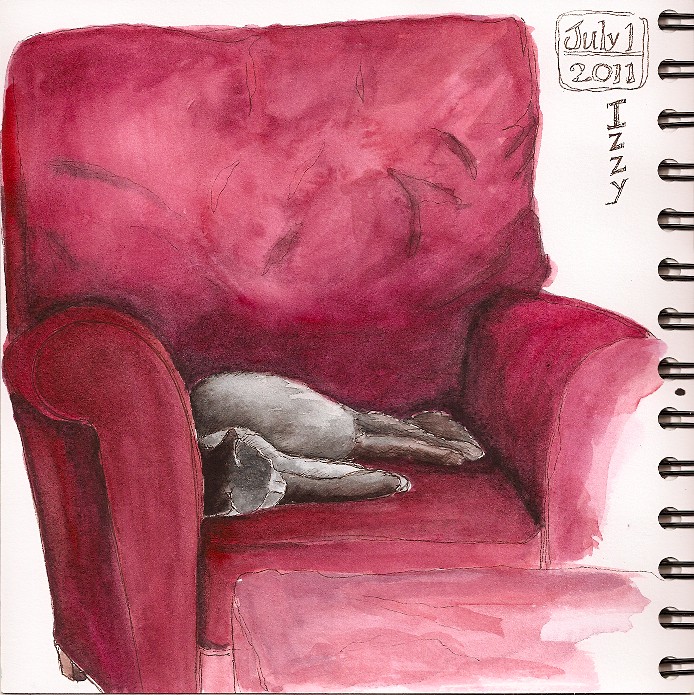
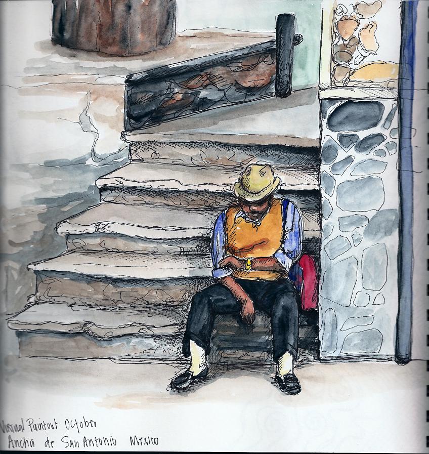
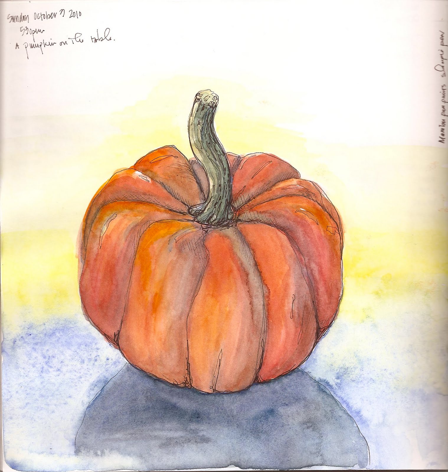
A journal journal that’s real and a reflection of you and your life.  Go!  Smash some of your life today into those pages:  receipts, recipes, drawings, photos, thoughts and all.  It will be beautiful because it will be uniquely you.  I know that’s what I cannot wait to see in December, the completely unique approaches, the beauty that we each placed on the pages that reflects who we are and where we are at that day the page came to be smashed together.

Sketching at the Minnesota Zoo

I have been so behind on scanning and posting my work this fall.  It is not because I haven’t been out sketching but mostly because I have been busy and would rather spend my time making art than scanning art.  To try and remedy this situation I am going to be doing a couple of quick posts this week and next with simply a few images and minimal text, showing some of my sketching out adventures from this fall.

Hornbill sketch in handmade book on Rives BFK,
PITT pen size F, Daniel Smith watercolors.
Sketched from life a the MN Zoo.

These sketches are from the end of September at the Minnesota Zoo where I spent an afternoon sketching and enjoying beautiful fall weather outdoors with a good friend and her young daughter.  We had a great day sketching, enjoying the animals and each other’s company.

Oaks on the grounds of the MN Zoo in Apple Valley.
Handmade book with Rives BFK paper, Faber-Castell PITT calligraphy
pen, Daniel Smith watercolor

Peony

Peony from my garden-
Handbook brand journal, PITT Brush pen in cool grey, Daniel Smith watercolors
7.5×16 inches

After looking at this peony, that I cut from my garden specifically to draw, for three days I finally sat down and just made myself do it.  I have been thinking it was too complex and that I could never get it right and that it would take forever…. Basically whining to myself that I am not good enough or that I do not have the time and letting that little voice win.
Well today, after reading Danny Gregory‘s post about that voice, the one we all have that keeps us from doing whatever it is we truly love to do, I just did rather than talk myself out of it.  And as always it feels good.  Feels good to have a finished page, good to have spent an hour painting, and good to not have listened to that nasty little voice in my head telling me I am no good.

Winter Continues

Daniel Smith watercolor, white gouache,
and Faber Castell PITT pen in a handmade
journal with fawn colored Stonehenge paper

Winter wants to hang on here in Minnesota.  This was the scene outside of the Minnetonka Center for the Arts on April 12th and I needed to use white gouache to show the drifts of new snow we had gotten the day before.

Upcoming Not-So-Blank-Page Project

My crow (watercolor on added in paper) on
Roz’s Squiggle background (see original below)

On Monday February 18th Roz Stendahl and I unveiled the new collaborative project for the MCBA Visual Journal Collective.  The project is called “The-Not-So-Blank-Page” and involves the group creating a collaborative custom “smash” journal.  Participants in the project will create two unique, original backgrounds that will be photocopied and become a part of the spiral bound journal that each person will fill between the April meeting (when we deliver the books) and the December meeting when we will have a simultaneous viewing party.

Examples of pages from the project prototype. . .

Roz’s Squiggle background made
as an example for our upcoming
collaborative journal project

As preparation for this project Roz and I exchanged a couple of backgrounds via computer and I ran and had example copies made into a small prototype journal to experiment in with different art materials and to test the nature of the pages when they came in contact with water based products like paint.
I discovered that the copies took watercolor and a wide range of other art supplies fairly well.

My watercolor pear on Roz’s photocopied background.
I was testing the paper and the copy to be sure both
stood up to water based journal work.

The photocopied image is very waterproof, none of the pages I worked on bled or changed due to the water in my paint and sheets only buckled somewhat after having paint applied; the image above has paint on both sides and some buckle is evident.  As you can see in the image above, the copy does resist the color, which makes very heavily imaged sheets a bit more challenging to work on than sheets that are more open or white.  I dealt with that problem by either letting the paint sit and soak in (interesting effects as can be seen in my heron page posted on Roz’s blog post about the project) or by adding my journal elements on via collage (crow above, and both of the following examples).

On the left: my background made as an example for the project
On the right: my art work and collage element on the page

On the left: Roz’s background made as an example for the project
On the right: my art work and collage elements on the page

Interested?  Keep reading.
How to be involved . . .

The Details:

Each person will create two separate 8 1/2 x 11 (portrait orientation) original backgrounds – 
        Work only on one side of the paper you use, do not sign your work.  Label the back of each page with your name, neatly printed and either “page A” for right handed page or “page B” for left handed page.  See the example diagram below which includes two pages front view, showing how they will be bound and a back view of each page, labeled correctly.  Because of printing limitations each sheet will lose about an 1/8 inch around all sides – be sure to keep any key elements away from the very edge of your pages.
All artwork will be photocopied for use in this project, with that in mind please keep all artwork flat and do not use anything that you do not have the copyright for in your background.  
Keep in mind that other artists will be using your page as a backdrop for their journal page at some point in the project, any element that you include can or will be covered, distorted, altered, or changed to suit the needs or desires of the new owner of the page.  All art work created on pages become the copyright of the artist who worked on the page, your background will only be your background when it is empty of another artist’s work.
No pages can be removed!  We will view these together and want to see what each person does to each page, it would be no fun at all if we get to your page and it is missing!  If you make a “mistake” or really struggle with a background challenge yourself to work around it by adding a collage sheet over the problem area or using gesso to lighten a problem spot, etc.  There are lots of ways to continue to work and change a page for the better without resorting to its removal.
Backgrounds need to be complete and turned in at the March 18, 2013 Collective meeting along with a check to cover photocopying and binding costs associated with the project.  We are not making any profit on these books, we are only charging each person exactly what it costs to create the journal.  Costs are to be figured based on the number of participants x $.50 photocopy costs +$2.75 binding. (if 30 people participate the cost will be $18)
Payment is due when you turn in your artwork at the March 18th meeting, we will know at that point how many people are joining in on the fun and can give a price to all involved.  Please be prepared to pay with cash or check, made out to me, Suzanne Hughes, as I am the one who will be dealing with the copies and book production.
If you can not make the meeting but want to participate, please send your art work to: Roz Stendahl, P.O. Box 141434, Minneapolis, MN 55414. (Roz doesn’t get mail delivery before the Collective on Monday so she needs to have your artwork in hand on Saturday to ensure you’re in the count.) 

Mail in participants will be notified of the final cost, contacted (include email when mailing work), and will need to respond by March 19th that they are still participating and mail a check to the same address by March 25.
If you are unable to pick up your journal at the April meeting you will need to let either Roz or me know so alternate arrangements can be made for delivery of your book (potential fee for postage, pick up on Open Studio night at MCBA, or the May meeting as a last resort).

Additional information, examples, and details can be found at Roz’s blog post about the project.

Museum Visit – Terracotta Warriors

Warrior Horse
Faber-Castell PITT pen size F with
Daniel Smith watercolor wash on
Fawn Stonehenge paper in handmade journal
Quick sketches of carriage horses
and a few objects with notes
Faber-Castell PITT pen size C & F
Fawn Stonehenge paper

On January 10th I visited the Minneapolis Institute of Art with my ceramics students to see the exhibit of China’s Terracotta Warriors.  We went through the exhibit with a docent who had loads of information, but was in a rush to get us through to see what she had information about in a specific amount of time.  I sketched as much as I could while we were there but  was also supervising my students and trying not to loose our guide, who slid through the very crowded exhibit space like a ninja.
Our guide was quick to inform us that we could not take photos but she was surprised and had no real answer for me when I asked if I could sketch.  I was the first person she had ask about sketching the warriors.  I sketched and had no problems with museum staff at all.  I did add all the paint on these pages at home, I didn’t need to get kicked out.

Quick sketches of  warriors
Faber-Castell PITT pen size F
Fawn Stonehenge paper 
I am planning on going back to the exhibit with my family so I can hopefully sketch more and also enjoy all of the objects I missed while being there with a guide and a school group.  
My two favorites of the day were the horses and the bronze birds both were beautiful and more memorable for me than the warriors themselves.  The exhibit is on display until January 27th and it is highly recommended to get your tickets before you go (I have had friends turned away because the gallery the exhibit is in is too full).  You can follow this link to the Minneapolis Institute of Art webpage for more information if you are interested in more information about the warriors and the exhibit.
Quick sketches of  the bronze Crane
Faber-Castell PITT pen size F
Daniel Smith watercolor washes (added at home)
Fawn Stonehenge paper in handmade journal 

Trying for Daily

I have been trying to get into a daily sketching habit over my summer break, with the hopes that it will hang on through the entire year. Don’t get me wrong I draw fairly regularly but I am trying to get better about using my journal as a daily drawing break. So far I have been doing quite well with getting in at least one drawing a day, sometimes even more. It really helps that I have gotten a purse big enough to hold my sketch book and a small sketch set, so no matter where I go I have my stuff and if I can take a break for even just a ten minute sketch I am grabbing the opportunity.

This sketch is from this morning over coffee, watching my cat Izzy sleep on the chair across the room from me. She sleeps here for about an hour every morning, today I took the time to fully record it in paint on paper. Her gray fluff makes for great contrast from the red chair.
Sketch done in Pitt pen (brown, my current favorite) in a Stonehenge paper journal (which pilled a little on the chair back as I worked), with Daniel Smith and Grumbacher watercolors.

Virtual Paintout – San Miguel de Allende, Mexico


Tonight while hanging with my family and watching some TV, I finally got around to completing another Virtual Paintout. I always find shots, I almost always start, I rarely finish lately.

Today, I spent about an hour on this in my sketchbook. It was fun to draw curled up on the couch, with my laptop beside me and the book on my lap.
The drawing was done in a sharpie pen, watercolor was added (with my Niji brush and a travel pan set), and then I finished up with more pen over the top of the color washes.
I am using an AquaBee Super Deluxe 9×9 inch spiral bound sketchbook right now, the one with heavyweight(150 gsm) paper. As far as watercolors, I am using an old pan set from Marabu, that I got at an estate sale. I just checked their website and they don’t even make watercolors anymore. Lots of other cool looking paints and supplies, no watercolors.

Busy Fall

As a teacher, fall is always busy with setting up a classroom and getting back into the swing after the summer, but wow, get a new job at a new school and that is magnified many times over. I have been so overwhelmed. I realized a couple of weeks ago that I haven’t been taking time to make any work for myself, not even sketching, only class examples and demonstrations. So, last week despite being sick and having conferences I forced myself to draw for the first time since the state fair really.

It being autumn I have a small collection of gourds and squash that are in a platter on my table and they have served as my subject matter for the last week as I get back in the groove of daily drawing again.

I have been on a roll with my goal to draw everyday again and intend to keep at it, as it always feels good to sit and take a sketch break.
I am also trying to finish up the Aquabee sketchbook I have been working in so I can begin to test and use the two new sketchbooks I have been given to try out. Both books are spiral bound and new to the journal market this fall. One is made by Strathmore and the other by Legion, both companies are trying to move into the art journal market with new products and the visual journaling group I belong to received samples to test run. I am looking forward to fun journal experiments.

MCBA Visual Journal Collective and an owl

On Monday night I attended the MCBA Visual Journal Collective meeting, with Roz Stendahl and 18 other members. We met at the Textile Center for a hands-on demonstration of fabric screen printing using an image from our sketchbook or journal. Karen Wallach, a collective member, gave the demonstration as she belongs/works for the Textile Center. The process itself used a ThermoFax to produce the screens. It was quite interesting and loads of fun.

We were asked to bring in a sketch or drawing to use, along with any fabric, paper, or clothing we wanted to print onto. Quite a few people, myself included, needed to redraw our image using black pen and white paper, as we were supposed to have a simple black and white image like you would carve a block print from. I brought a photocopy of a watercolor and ink owl from a graffiti project example I did during the school year. The original image:

So, before the start of the printing process I had to redraw the owl as a simple line drawing in my journal, which would then be made into a toner based copy to be used in the machine. Karen was the checker of images to be used (she wanted us to have success) and she was unsure of whether or not mine would show all the tiny line detail as a print, but I forged ahead anyway willing to take the risk.

The process itself involved taking our copy, matching it to a screen frame size, and cutting the correct amount of silk screen to fit the frame. Our image was then placed into a plastic carrier sleeve and sent through the ThermoFax machine. The heat from the machine “burns out” the toner ink from a gel on the back of the screen, creating tiny holes for the ink to be pushed through. We then took our screen and mounted it to the plastic frame and encased the entire frame and the edge of the screen in duct tape (have to love that stuff).

After our screen was made, we took it into the next room and printed from it. I have to say there is something very magical about using your image to create prints, it just makes me smile to see multiples that are all original. My image turned out great despite the potential for some of the fine line detail to be lost. My only problem came from not quite pulling the ink all the way down into the tail in every print.
Karen had muslin available for us to practice on and a range of fabric inks and acrylic paints to try. I stuck with black acrylic printing ink made for fabric. I printed a couple of practices on the muslin and two prints on some batik fabric I brought from home.

At that point I switched to paper and printed on two bags, the type that come from a wine bottle, all tall and skinny. I also had a pre-painted sheet of heavy watercolor paper, and a sheet of red print making paper that I tried as well.


By the end of the night I had printed on a variety of surfaces both fabric and paper and was quite pleased with the results, and especially pleased to be able to take home my screen to continue to print from.

I highly recommend giving the screen printing process a try. There are several resources for having your own images made into screens available online, just search ThermoFax printing, and I am sure you can find a spot near you that will make screens for a reasonable price. The Textile Center here in Minneapolis will make them in three sizes: 8×10, 5×7, 3×4 (roughly), for $12, $8.50, and $5.50 respectively.
Well, I am off to print my owl onto my apron.